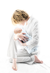
The above image was made with five different photos, then mixed together in Adobe Photoshop to create the final image.
For lighting, I used two or three Nikon SB-80 DX flashes, with dome diffusers on them, behind the mother. She is in a small 4'x5' "hallway" that connects three different rooms. This 4x5 space was closed on three sides by doors and a wall, creating a light tent effect, wrapping her in glowing light.
In Photoshop I blended the photos of each leg, one of each model's head, and one of the mother's arms and torso. The infant photo was actually taken several months prior to the mother photo(s). I warped the mother's torso to create a more upright and squared look to her back and shoulder. Several different adjustment layers created the coloring and added to the high key effect of my lighting. Also added lighting effects to the infant's head to help it look more like a part of the image.
I think I need to revisit this image, to try and achieve a more natural look to the infants head, making it look less like it was added in to the image. But overall, I'm pretty pleased with it. Thanks to my wife, Karleigh, and son Jadon for modeling.
.jpg)

No comments:
Post a Comment