.jpg)
 Made in Inkscape.
Wednesday, November 25, 2009
Tuesday, November 24, 2009


Monday, November 16, 2009
If You Ever Meet a Whale

If you ever, ever, ever,
If you ever, ever, ever,
If you ever, ever, ever, meet a whale,
You must never, never, never,
You must never, never, never,
You must never, never, never touch its tail.
For if you ever, ever, ever,
If you ever, ever, ever
If you ever, ever, ever touch its tail,
For if you ever, ever, ever,
If you ever, ever, ever
If you ever, ever, ever touch its tail,
You will never, never, never,
You will never, never, never,
You will never, never
Meet another whale.
Sunday, November 15, 2009
Ugly Pictures Part 2: Gamma problem, or something else.
Edit: I do now think it's just a difference in how some monitors are displaying the images, some look right, some are skeewampus, and probably because the monitors are set to too high a contrast or brightness, overpowering the somewhat light colors in some of my illustrations. I think that's it. Maybe. I'm considering that I'd like to use bolder colors anyway, which would also help out with the illustrations displaying acceptably on other computer screens.
In my last post, I was alarmed about my illustrations looking waaaay bad on another monitor. Not good bad. Bad bad. I set out to figure out why.
I researched a bit, and although I don't have the computer on hand that was displaying my illustrations much too brightly, I think that that particular monitor's brightness and contrast settings must have been way out of wack. I now suspect this because I created my images with a monitor gamma setting of 1.8 (brighter), and most other monitors should display at a gamma of 2.2 (darker). Thus, that monitor should have shown my images darker, not brighter. Even if that monitor was set to display at a gamma of 2.2 (darker), other calibration settings on the monitor might have countered the gamma to create a brighter than usual display. I think. I'll check it out when I get another chance to sit down at that particular computer.
So, if in this illustration you can see the border, and circular shadow shape under the tree, and textured lines behind the tree, and shadows under the presents, then you are seeing a good approximation of what the illustration is intended to look like. And all the illustrations in earlier posts would be displaying just as well on your monitor. If not, you may have a monitor with an out of wack calibration (too bright and/or too contrasty).
I'm not fully settled that this is the full problem. Because other images besides my recent illustrations looked alright to me on that monitor. (?) I'll need look into this more.
Helpful links for those interested in knowing more about gamma and color management, which might include anyone, especially anyone making images on and/or for computer display or for print:
John Nack on Adobe: Why Your Web Content Will Look Darker on Snow Leopard
Not as informative for me as the previous link, but helpful, especially for learning how to set the gamma to either 2.2 or 1.8 on a Mac.
In my last post, I was alarmed about my illustrations looking waaaay bad on another monitor. Not good bad. Bad bad. I set out to figure out why.
I researched a bit, and although I don't have the computer on hand that was displaying my illustrations much too brightly, I think that that particular monitor's brightness and contrast settings must have been way out of wack. I now suspect this because I created my images with a monitor gamma setting of 1.8 (brighter), and most other monitors should display at a gamma of 2.2 (darker). Thus, that monitor should have shown my images darker, not brighter. Even if that monitor was set to display at a gamma of 2.2 (darker), other calibration settings on the monitor might have countered the gamma to create a brighter than usual display. I think. I'll check it out when I get another chance to sit down at that particular computer.
So, if in this illustration you can see the border, and circular shadow shape under the tree, and textured lines behind the tree, and shadows under the presents, then you are seeing a good approximation of what the illustration is intended to look like. And all the illustrations in earlier posts would be displaying just as well on your monitor. If not, you may have a monitor with an out of wack calibration (too bright and/or too contrasty).
I'm not fully settled that this is the full problem. Because other images besides my recent illustrations looked alright to me on that monitor. (?) I'll need look into this more.
Helpful links for those interested in knowing more about gamma and color management, which might include anyone, especially anyone making images on and/or for computer display or for print:
John Nack on Adobe: Why Your Web Content Will Look Darker on Snow Leopard
- Lots of pertinent info, whichever OS you use. Read the comments after the article for lots of further info, corrections, and clarifications.
Not as informative for me as the previous link, but helpful, especially for learning how to set the gamma to either 2.2 or 1.8 on a Mac.
Saturday, November 14, 2009
Ugly Pictures (gamma problem, or something else?)
Edit: Okay, I researched a bit, and have some more info. See what I learned in my next post.
So, just saw my recent illustrations in earlier posts on a different computer, and they look terrible as compared to on my screen at home. Something's haywire with how they may be appearing on your screen as compared to how they should look. I have a couple ideas on what to do to fix that. Stay tuned.
So, just saw my recent illustrations in earlier posts on a different computer, and they look terrible as compared to on my screen at home. Something's haywire with how they may be appearing on your screen as compared to how they should look. I have a couple ideas on what to do to fix that. Stay tuned.
Friday, November 6, 2009
Whales and Baby Books
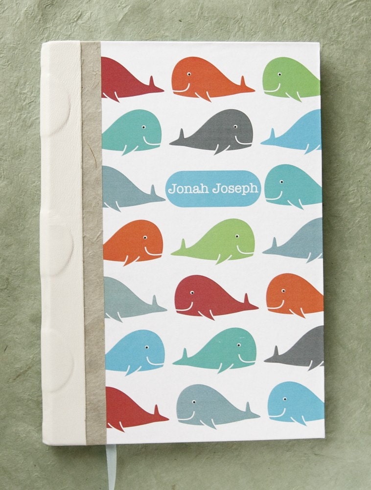
My wife, Karleigh, had a custom order request for a baby book with whales on the cover. So, I created a pattern in inkscape.
Subscribe to:
Posts (Atom)
